HELLO VISITORS! This page aims to share some of the skills of the members of the AAG with other members and interested students of Art. WELCOME AND ENJOY!
ENJOY THE FOLLOWING LESSONS:
click on: WATERCOLOR LESSON #1: BRILLIANT PETS & CREATURES, Featuring:
Tracing and Transferring Images to Watercolor Paper
Basic Watercolor Techniques
Understanding Color Triads and Color Terms
click on: DRAWING LESSON #1: 1-POINT PERSPECTIVE CITY STREET SCENE, Featuring:
Basics of One-Point Linear Perspective
Drawing Cars and Vehicles in 1-Pt. Perspective
Using Watercolor Wash and Ink Lines for Urban Sketching
click on: WATERCOLOR LESSON #2: REALISTIC PET PORTRAIT
Step-by-Step procedure, using basic watercolor techniques in Watercolor Lesson #1
_________________________________________
WATERCOLOR LESSON #1:
Watercolor Lesson No. 1
BRILLIANT, COLORFUL WATERCOLOR OF AN ANIMAL!
This is a lesson from Kevin Kuhne’s workshop: “Brilliant Pets and Animals” which introduces a fun way of painting. The goal is an introduction to some of the major watercolor techniques and understanding how pure color can liven up an image. Leave your browns, blacks, and grays at home for this one!

STEP 1: Find a picture of an animal, the actual size that you wish to paint it. For this lesson, we are not doing a “portrait”, so a full-body image would be best…such as the one below:

Here’s our girl in full color. You’ll find that you can free your sense of color by working from a black and white image such as below. This way you will just see value (black through white) and not worry about trying to match up the “local color”. (For example: the grass is “green”, the sky is “blue”, the apple is “red”, the sheep is “gray”)
Here she is in black and white…now we’re free to make her any color we choose!

STEP 2: Trace the animal on a sheet of tracing paper, or you can just put a piece of graphite transfer paper under the picture and draw over your photograph. These instructions will be for the old-fashioned tracing paper transfer method which you can use in future lessons. WHY TRACE? Even if you are an expert draftsperson, you may find yourself erasing on watercolor paper, which destroys the surface, so it’s preferred to make your drawing on separate paper such as tracing paper, whether your tracing or not. If you are not confident about your draftspersonship, and you just want the pleasure of painting, then trace!
Whether tracing or using transfer paper, put the paper over the image and hinge it at the top with tape. This way you can lift up the paper easily to see how you’re transfer/tracing is going.

Here’s the tracing with the picture removed from underneath.
Now turn your tracing over, and trace over the lines with a soft pencil or stick of graphite. Turn it back over, right side up, hinge tape over the watercolor paper you will be working on, and with a stylus…(I like to use a ballpoint pen, lightly…it transfers the line nicely and it’s a different pigment from the pencil)…draw over the lines of your animal once again. Lift up your hinged tracing paper every now and then to make sure you’re not missing any lines. Once you’re done, you should have your image, in graphite, on your watercolor paper, and you’re now ready to paint!
STEP 3: LET’S TALK ABOUT COLOR FIRST!
We’ll be using 3 pure colors…no white, no black. In order to decide which 3, you will experiment by making color “triads”, which are 3 colors formed by a triangle on the color wheel. A true triad is made with an equilateral triangle on the color wheel and using the 3 Primary Colors: Red, Yellow, and Blue. But normally, a triad can be formed by drawing an equilateral triangle anywhere on the color wheel, like this:

Usually, I create a triad by drawing any kind of triangle on the color wheel, as below:

Experiment making a few triads which you will use to paint your animal. Wet down a portion of your test paper with plain water. Get plenty of your first pigment on a clean brush and touch it to the wet paper. Wash your brush out and get the second pigment and apply, allowing it to mix and flow and “mingle” into the first color. Wash your brush out again, and do the same with the third color. Keep adding color and/or water (a spray atomizer helps) to get different mixtures and values. ALSO, STICK WITH TRANSPARENT COLORS! You’ll learn which colors are transparent and which are not, but here’s a few tips:
AVOID cadmiums, Naples yellow, most warm reds (e.g. scarlet or vermillion), most cool yellows (e.g.lemon), cerulean blue, yellow ochre
SAFE BETS: Ultramarine Blue, Cobalt Blue, Prussian Blue, Alizarin Crimson, Raw Sienna, New Gamboge yellow, Permanent Rose, Burnt Sienna, Viridian Green, Windsor Violet
Try a few triads until you find one that you like:

Notice the white spots on the lower right triad. This was done by dabbing a facial tissue into the wet paint and “lifting” pigment off the paper.
STEP 4: Now, decide which triad of colors you will use for your animal. Think of your lightest color as where your lights will go, your medium value color as where your medium values will go, and your darkest color for your darkest values. Wet down your entire animal in your drawing on your watercolor paper…EXCEPT FOR THE SECTIONS YOU WANT TO STAY COMPLETELY WHITE. Start “dropping” colors into your animal (lightly touching the wet paper with pigment on your brush, allowing the pigment to flow into the water on your paper, allowing it to flow.) Use lots of pigment because it will dry much lighter than you expect! Here’s an example:

Notice how I kept the paint away from white areas by not wetting that area. I then dropped in some Raw Sienna (a yellow) in light areas, some alizarin crimson in medium areas, and some ultramarine blue in dark areas. I also dropped more alizarin in with the ultra to create beautiful purples. Then I wet some of the background behind the sheep…especially behind the white areas, and dropped in light washes of raw sienna and ultramarine blue. You could drop in darker washes for more contrast. I also did the same with the shadows on the ground. The “grass” lines you see were done by scratching (incising) with a pointed stick, such as a toothpick.
A TIP ABOUT “OVERWORKING” AND “MUD”:
First of all, I hate these terms. “Overworking” really means adding more detail than you need. “Mud” means having areas of dull, flat color. How do you avoid these? Don’t add a lot of detail until you’re ready to finish up your picture. And, “mud” happens in several ways: 1) adding water and pigment into areas that are starting to dry…those areas are losing their wet luster, even if they are still damp….2) brushing your paper too hard (scrubbing with the brush), 3) mixing your colors on your palette instead of on your paper , and 4) using opaque colors such as cadmiums.
Here’s some more examples:


Notice the hair texture and detail around the eye, nose and mouth, done by incising with a sharp stick into the wet paint.
“DRYBRUSH” TECHNIQUE: Let’s practice this a bit. This is the method used to finish up your watercolor. Most of the time it’s not truly “dry” brush, because there’s some water in the brush…but pigment dominates! Forget all the above rules for wet-into-wet washes, mingling, and dropping in. However…do not use drybrushes for big areas, or it will look like “mud”. But this is where you will mix your colors on your palette. Practice with how dark you can get by mixing together all the colors of your triad, with very little water. Also, opaque colors are fine for drybrush. Remember, drybrush is used for small areas, texture, and details. It also adds a wonderful contrast to the wet-into-wet. Here are some examples from sumi-e (brush drawing)…notice the textural look of the brushstrokes…the paper or color underneath clearly shows through.
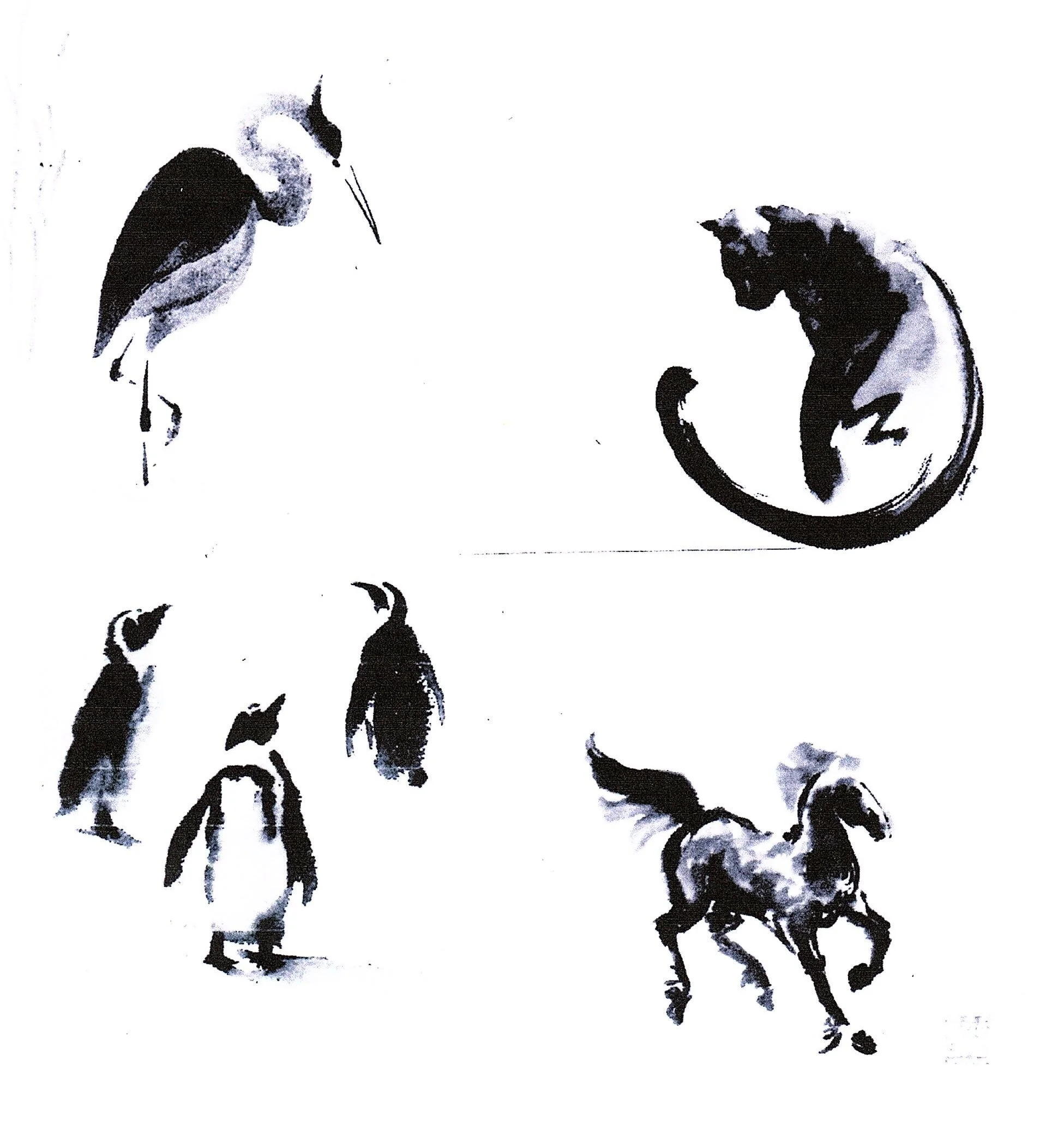
Notice the beautiful drybrush texture in the penguin wings, the cat tail, the horse legs, and stork neck & breast. This comes from dragging the pigment loaded brush across dry paper.
STEP 5: FINISHING UP:
Using drybrush technique, add details such as eyes, noses, mouths, horns, grass on the ground, etc. You can also use the technique of GLAZING which is a way of darkening larger areas or changing colors by painting a wash of color over a dry area. Use a light touch so you do not disturb the paint underneath…and only use transparent colors…and do not mix these colors on the palette…use pure colors out of the tube and enough water so that the color wash flows onto the paper.
Here’s our finished sheep: (please note: this is a different painting, same sheep and pose, but done with a different triad: Windsor Violet, Cerulean Blue, and Vermillion…I was very careful because I was using the latter 2 relatively opaque colors, so I just used very, very light washes of them, and let the violet dominate.

Notice the white lines for grass. This was done with my fingernail, scraping away the paint while wet. You can also use a cut up credit card or a metal palette knife for this technique. Also notice the white lines around the sheep…no white paint…just leaving the paper dry between washes.
AND HERE’S SOME MORE EXAMPLES USING THE SAME TECHNIQUES:

“Killer Squirrel in London Park”…a true pure primary Triad…whiskers done by scraping away the dry paint with a very sharp X-acto knife.

Here you can see how “realistic” you can go with this technique. The secret was adding a lot of incised hair texture while the paint was wet. I also used a small brush to drybrush in a lot of smaller brush strokes.

Another sheep with a pure primary triad. I even used Cadmium Red…very opaque, but notice how little is there, and in very wet washes that I did not touch after the initial application.
Drawing Lesson No. 1
SKETCHING A STREET SCENE IN 1-POINT PERSPECTIVE
This is a lesson from Kevin Kuhne’s “Urban and Suburban Sketchbook” class. The goal is to quickly render a one-point perspective street scene on site in pencil, wash, and ink pen.

View of Central Avenue in Albany on a cool December morning, from driver’s seat in the artist’s car
PART 1: SKETCHING IN THE SCENE IN PENCIL
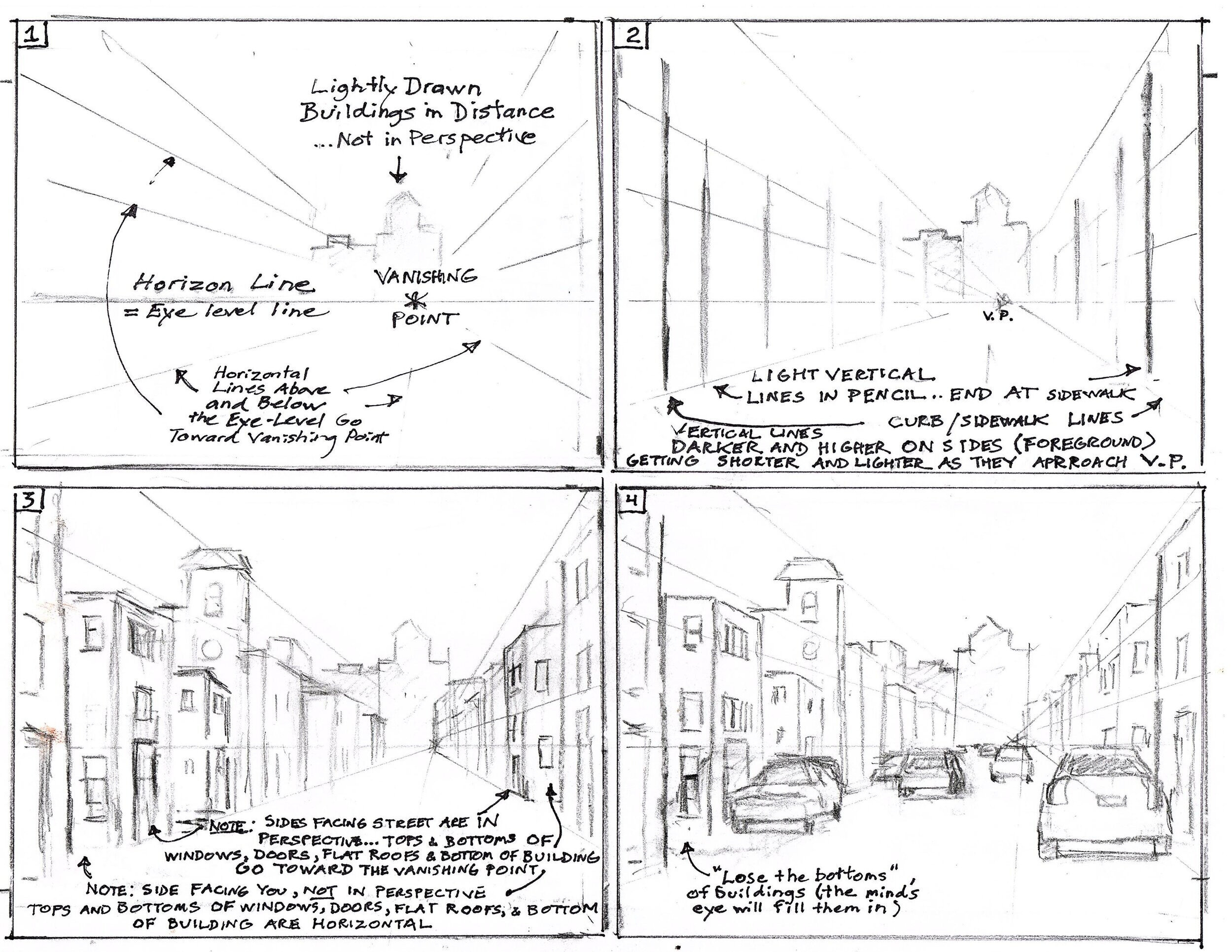
NOTES AND TIPS ON ADDING CARS TO YOUR STREET SCENE:

NEXT: ADDING WASH AND INK LINES TO COMPLETE:

GO TO KEVIN’S PAGE TO SEE SOME OF HIS RECENT SKETCHES AND PAINTINGS WHERE HE USES THE ABOVE PRINCIPLES: CLICK HERE: /kevin-kuhne
WATERCOLOR LESSON #2: REALISTIC ANIMAL PORTRAIT
Watercolor Lesson No. 2
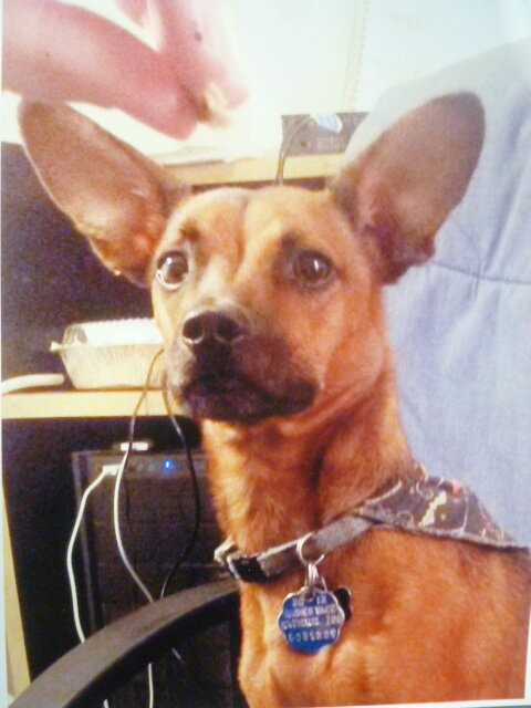
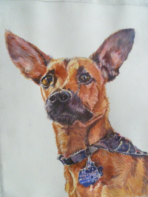
Photograph of Cooper and finished watercolor of Cooper.
STEP 1: PENCIL YOUR IMAGE ON TO WATERCOLOR PAPER The key to remember is not to do a lot of erasing on your watercolor paper, otherwise you will harm the surface of the paper. Therefore, use the transfer method explained in Watercolor Lesson #1: Colorful Pets. If you wish to freehand draw your animal, in order to control the size and exercise your drawing skills, work on tracing paper, and then transfer the finished drawing to the watercolor paper. This way you make all your corrections and erasures on the tracing paper. You can also use the same drawing to reproduce the painting again some time in the future. In other words, your drawing becomes a template.

A graph was drawn over the original photograph. Another larger graph was drawn on the tracing paper and the image transferred from the photograph square by square. I covered another piece of tracing paper with soft graphite, put it beneath the tracing paper, graphite side down, on top of the watercolor paper, and then used a ballpoint pen to trace over the top tracing paper drawing, thereby transferring the image to the watercolor paper in graphite.
STEP 2: INITIAL WET-INTO-WET WASHES After choosing my color palette, in this case Yellow Ochre, Permanent Rose, New Gamboge, Burnt Sienna, Ultramarine Blue, and Burnt Umber. I start with a watery wash of yellow ochre, reserving areas that will be white, the eyes, the collar, and background.

Watery yellow ochre wash, leaving whites, eyes, and collar alone.
STEP 3: Add more washes of permanent rose. Begin looking for middle values and adding these with stronger yellow ochre, using smaller brushstrokes and indicating the direction of the hair. I also added some New Gamboge in the eyes.

Permanent Rose washes. Stronger brushstrokes of yellow ochre, permanent rose, and New Gamboge.
STEP 4: Beginning light strokes with yellow ochre and burnt sienna looking for light and middle values. Also added light washes of Ultramarine Blue and Burnt Umber to indicate where dark values will go, such as on the snout and in the ears. Worked on patterns in Cooper’s kerchief.

Light strokes of yellow ochre and burnt sienna, plus light areas of Ultramarine Blue and Burnt Umber. Patterns on kerchief.
STEP 5: Using a No. 4 Round Brush, I began all over light and medium value strokes of hair, using permanent rose, yellow ochre, and burnt sienna. I looked carefully at the photo of Cooper in order to follow the direction of the actual hair. I also wet down the background and dropped in a very, very pale wash of yellow ochre, and immediately dropped in some ultramarine blue over that…just a suggestion of color to give some atmosphere.

All over light and medium value strokes of permanent rose, yellow ochre, and burnt sienna.
STEP 6: I started adding light strokes of Ultramarine Blue, Burnt Umber, and Permanent Rose in and around dark areas.

Light strokes of Ultramarine Blue, Burnt Umber, and Permanent Rose in and around dark areas.
STEP 7: Using the same palette and a No. 4 round, and using careful observation of the original photo, I rendered eyes, license tag, color, kerchief, nostrils, and darker shadows. Most of this was done “drybrush” (very little water, and mixing colors on my palette) and softening the drybrush edges with plain water.

Drybrush details added, including eyes, license, nostrils, collar, kerchief, etc.
STEP 8: THE FINISHED PIECE after refinements such as adding more hair texture, modifying lights and darks, softening hard edges with plain water, and “lifting” areas that may have been too dark by using a damp brush with no pigment.

The finished painting, after refinements.