A VIRTUAL HIKE UP BENNETT HILL
Click on each picture for a slide show:
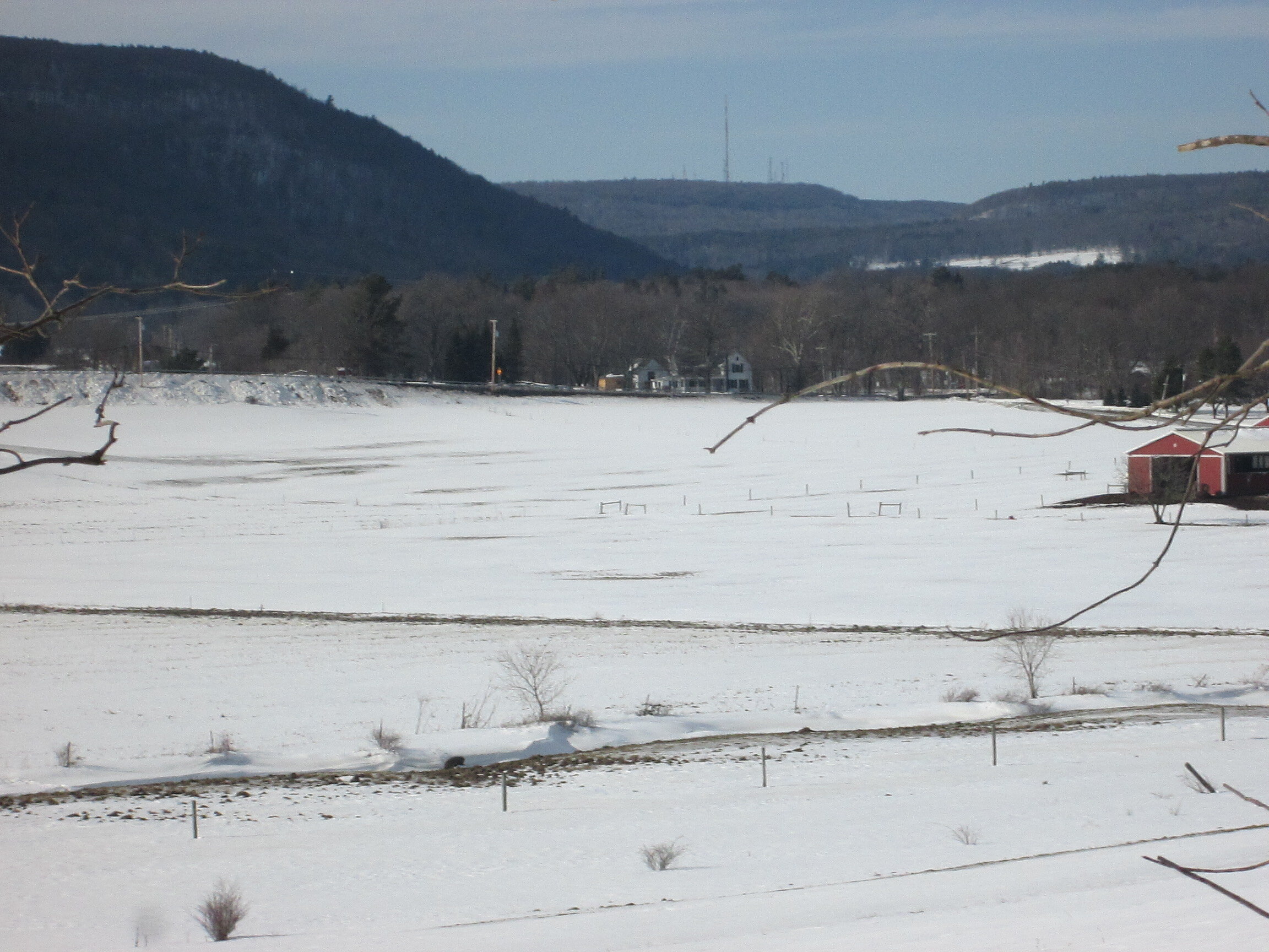
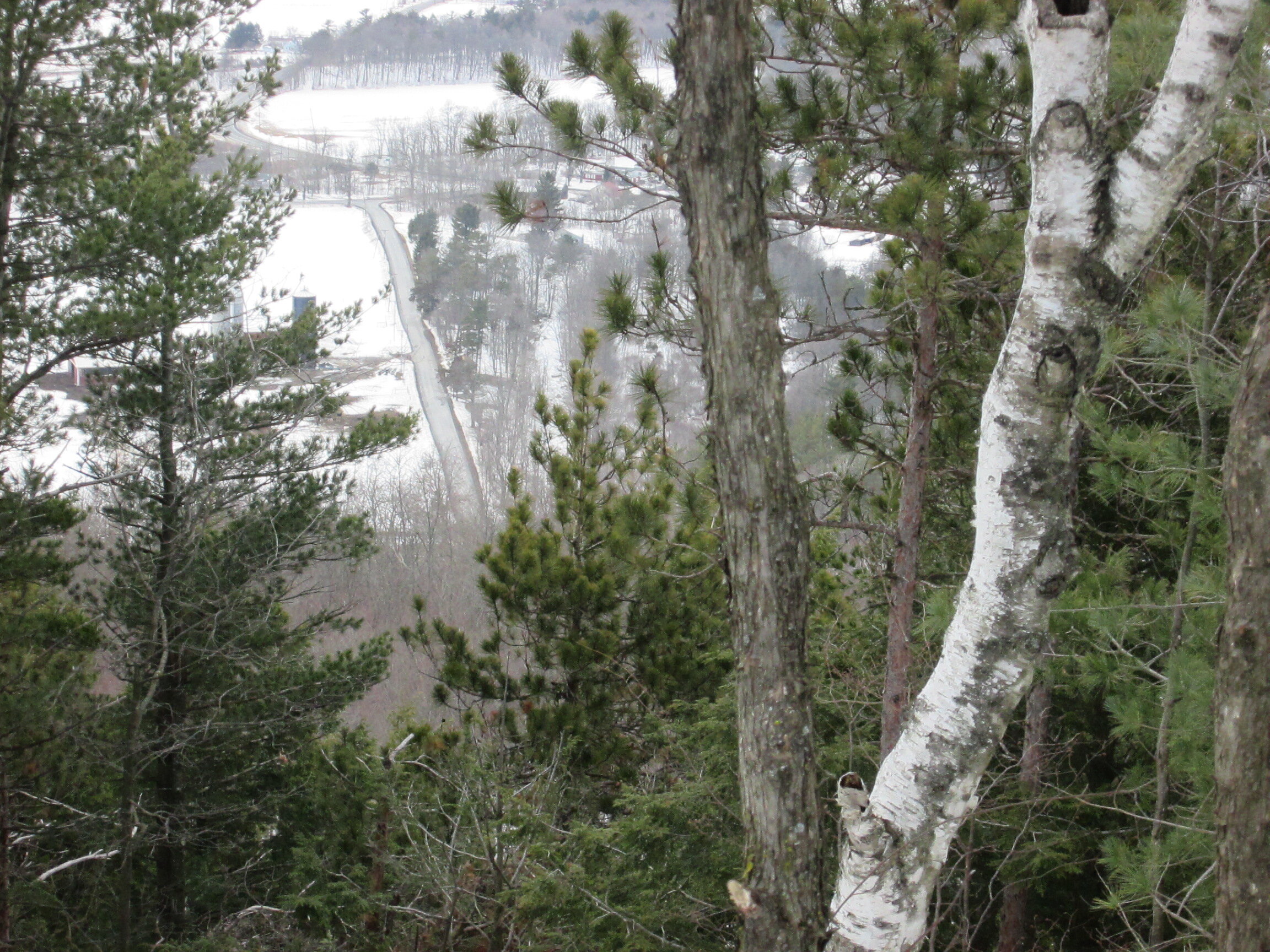


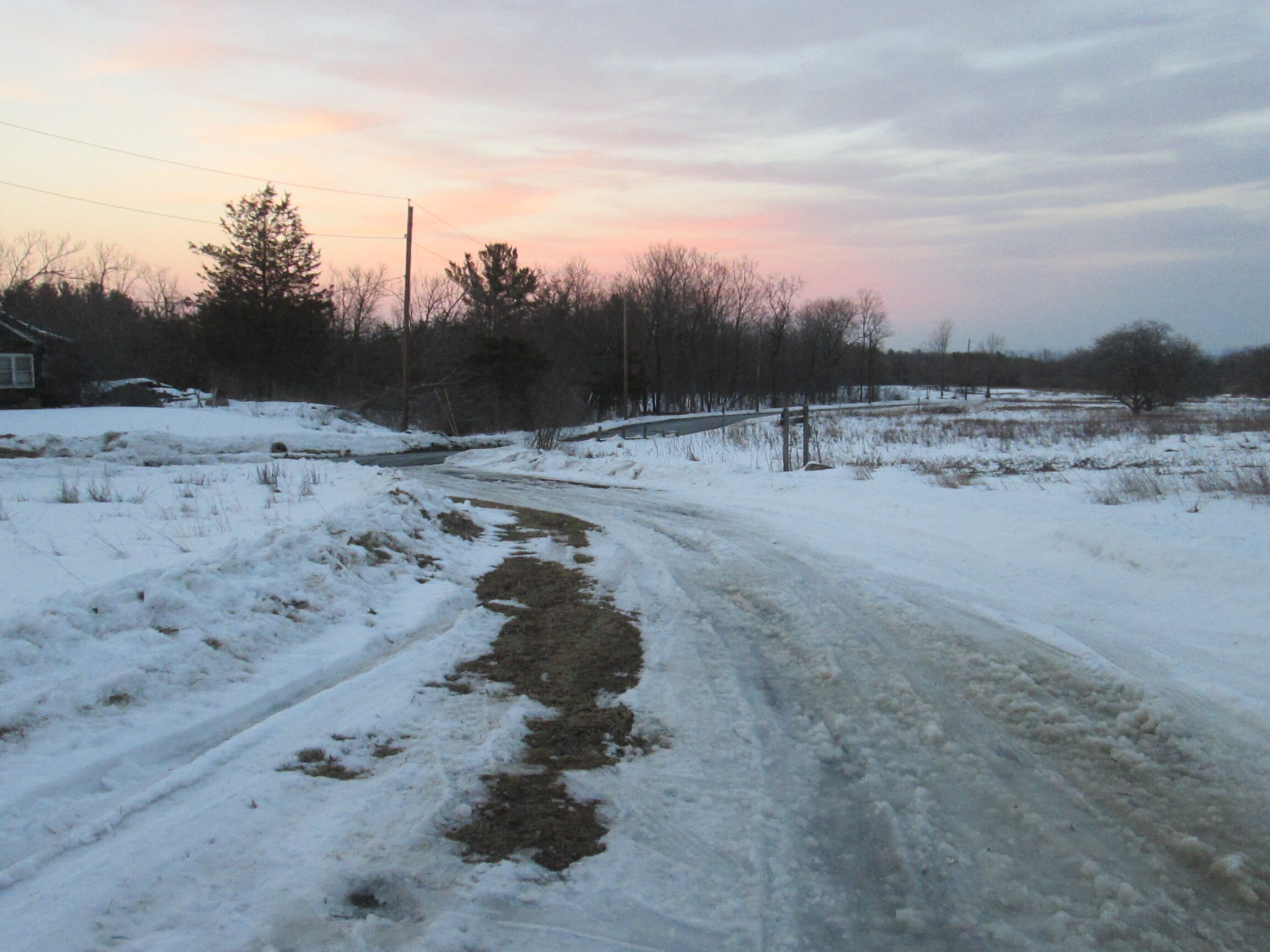


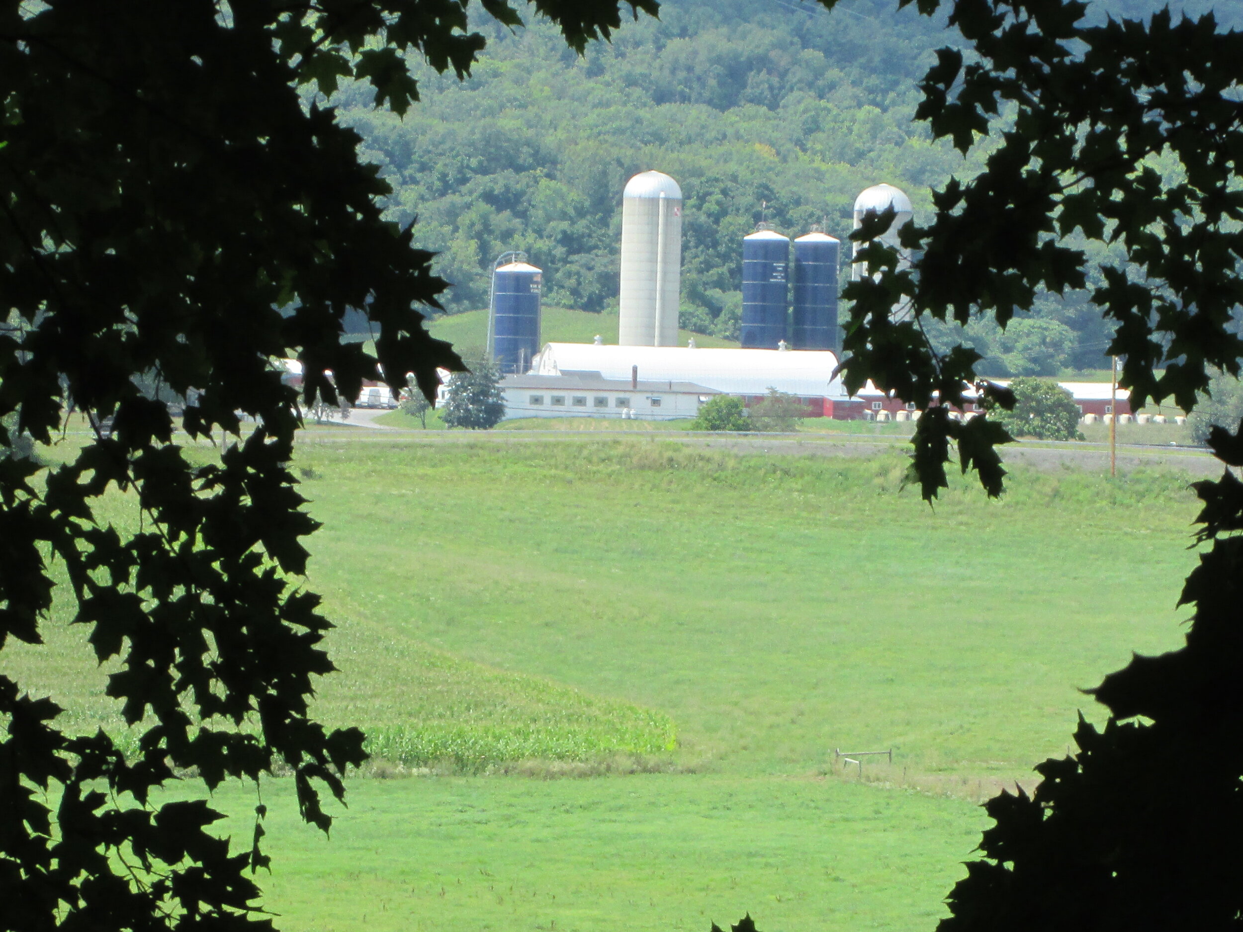

Looking toward the Helderbergs from Bennett Hill, Clarksville, New York
VIRTUAL NATURE HIKES
with ART
These are lessons inspired by hikes in the Albany Area, especially the Bennett Hill Preserve in Clarksville. Also featured are past paintings and photos from REAL hikes.
FOR A VIRTUAL HIKE AND A SELECTION OF SOME PAINTINGS OF BENNETT HILL BY KEVIN KUHNE, SCROLL DOWN TO THE BOTTOM OF THIS PAGE!
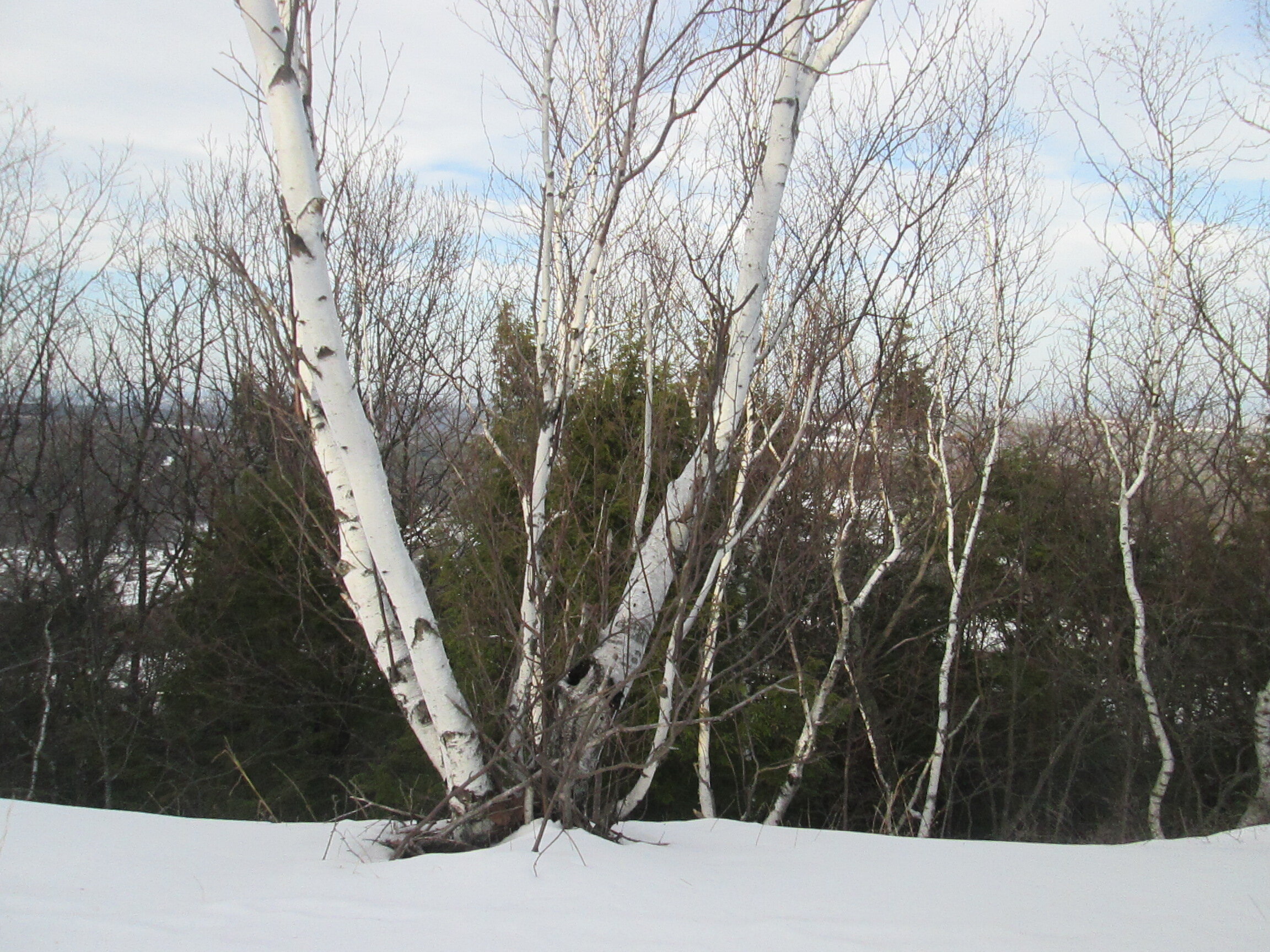
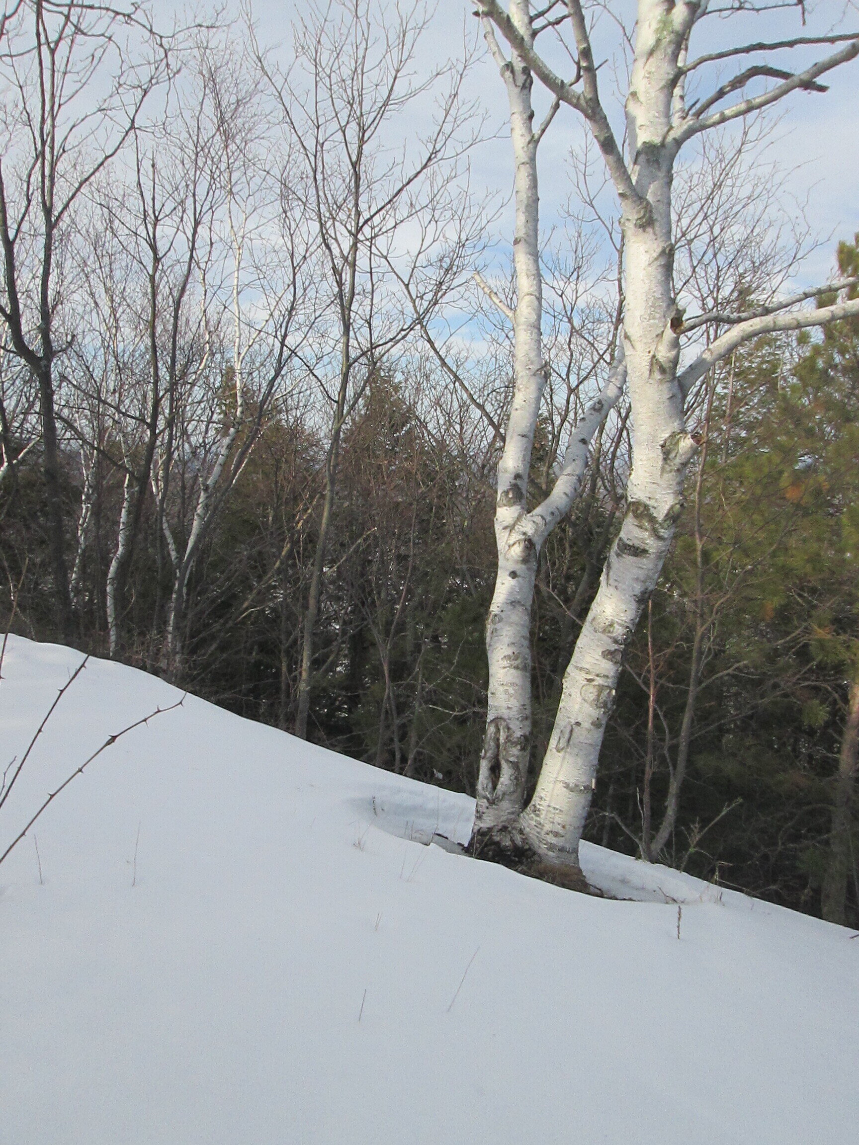
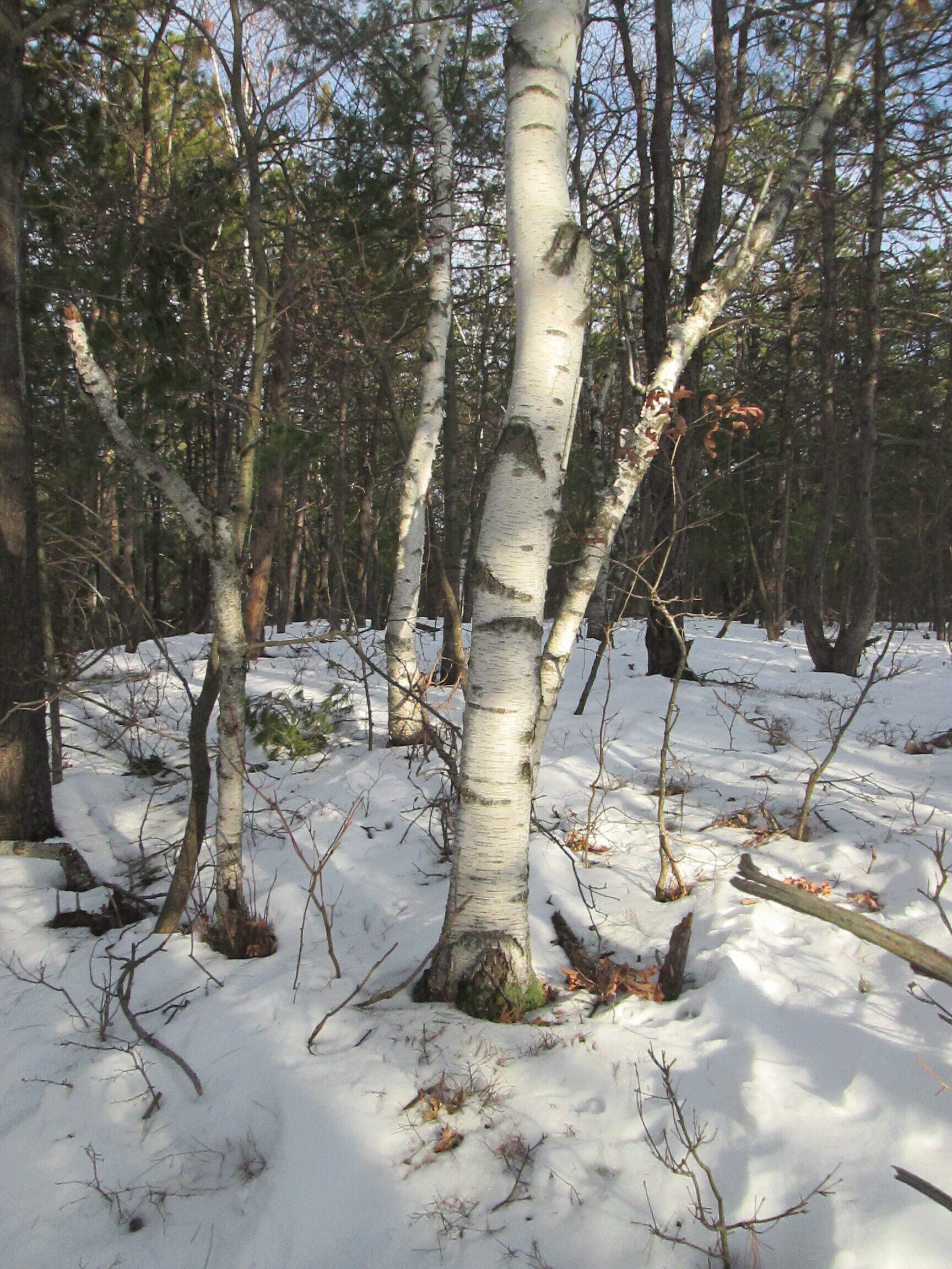
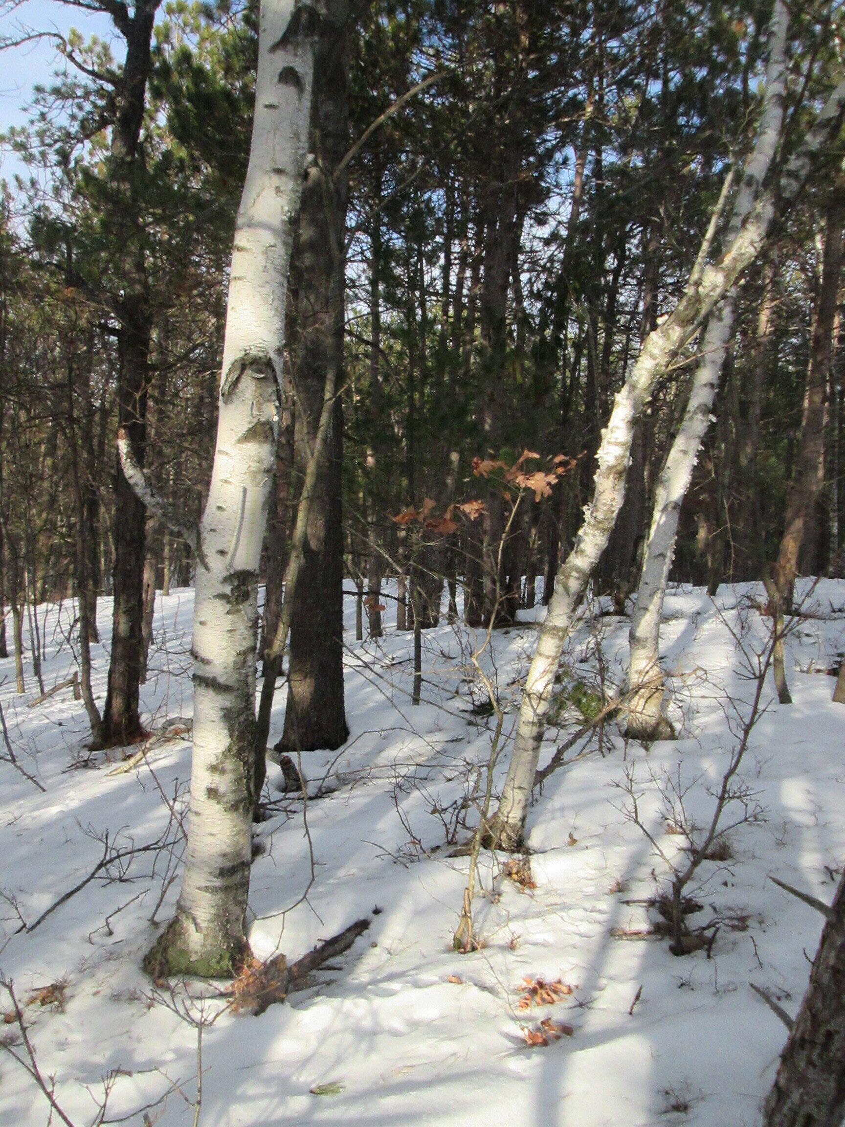
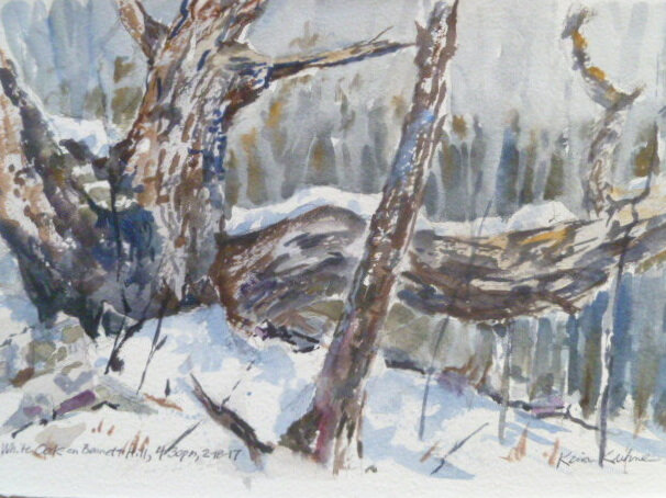
LESSON#1: Bennett Hill Birches in Watercolor…this is a lot of fun because you get to splatter all over with a toothbrush!

Birch Trees near the top of Bennett Hill during winter of 2018-2019

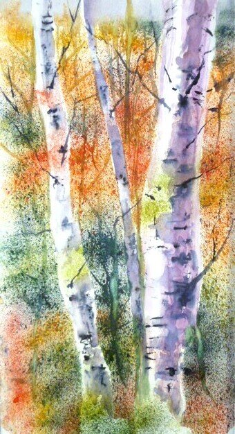
The finished painting.
SUPPLIES:
a DRAWING BOARDS 8” x 11” or larger…smooth, non-absorbent panel such as masonite, an old dry-erase board, plexiglass, or foamboard
· WATERCOLOR PAPER: Strathmore Series 400 140lb. Cold-Press paper is great for beginners. Some of these lessons you can even get away with the more inexpensive Canson XL watercolor paper (not mixed media). If you have higher quality paper, use it!
· BRUSH: A medium round watercolor brush (#6 - #10) or a 1/2” flat
· PALETTE KNIFE: a metal blade, 1/2"-1"...the offset "pointed" diamond shape works best. A cut-up credit card also works, with limited control.
· MISC.: a sharpened stick or toothpick, an old toothbrush…stiff! Roll of Masking Tape , Tissues, Paper Towels, Water Container
· PALETTE: commercial white one with wells, or Porcelain Butcher’s Tray, or even a white dinner plate or white plastic food container tops
· TRANSPARENT TUBE WATERCOLORS: (Grumbacher Academy or better) [ NOTE: Kevin will be demonstrating with Da Vinci colors)
Suggested Colors: (The following is the 8 color basic palette that Kevin Kuhne uses for all lessons) (For this demonstration, he will also use Paynes Grey and Windsor Violet)
1 Cool Blue: Cobalt Blue
1 Warm Blue: Ultramarine Blue
1Neutral Yellow: Yellow Ochre or Raw Sienna
1 Neutral Red: Burnt Sienna
1 cool red: Alizarin Crimson or Red Rose Deep
1 warm red: Cadmium red light, med, or dark; or Scarlet; or Vermillion
Viridian Green or Perylene Green
1 warm yellow: New Gamboge, Aureolin, Arylide, or Cad Yellow
Any of your favorite colors or what you have already!

For this lesson we’ll be using Canson XL watercolor paper, masking tape, an old toothbrush, the stiffer the better, and a piece of scrap magazine paper to use for tearing up


Step 1:
Tape down your paper on all sides. We are using a half sheet of 9x12 which measures 6x9, but you may wish to work full-sheet. Tear out strips of magazine paper to approximate the 2 large birches in the right foreground, and a few skinny birches in the left background. Notice…we will be using no pencils for this lesson…you are drawing by tearing shapes. Also tear some large pieces to cover the foreground snow. (don’t worry that it covers the bottom of the foreground trees). Arrange and tape down.
DESIGN TIP: Try to make all the spaces around the top, sides, and bottom of your paper be different lengths…no 2 intervals should be the same.

Practice splattering paint with your toothbrush.
Here’s the toothbrush splatter technique: dip the toothbrush in water and then pat it on a rag or paper towel to remove excess water…rub it into the color you want…I usually start with the lighter warmer colors…in this case, alizarin crimson…splatter on scrap paper by pulling your thumb over the brush toward you…if there is too many runny wet “blobs” of color and water on the paper, pat on rag again and try splattering again…you want a nice fine spray of color…do this every time you get fresh paint…wash your toothbrush off between colors…GO AHEAD AND PRACTICE FOR AWHILE…
Step 2:
Using your masterful toothbrush technique, apply paint to all the exposed areas of your paper. I started with cobalt blue in the sky. Then I went to Alizarin Crimson in some of the background areas. Then I cleaned my toothbrush and shifted to Viridian Green, and, finally, added some Windsor Violet. I was looking at the photo for inspiration, but, basically, I was just having fun. The more splattering you do, the more contrast you will have in the end. I was sticking with cooler colors, but you could be more brilliant with warm colors such as Raw Sienna, New Gamboge, Ultramarine Blue, and Vermillion.
Also, in the image below, you can see me adding a few distant tree trunks and branches into the wet paint by scraping the edge of my palette knife toward me, thereby removing some of the paint from the paper. For fine lines, I incised into the wet paper with a sharp stick, such as a toothpick.

Step 3:
After the paint has dried, remove all your magazine stencils and throw them away. Art is not eternal. Here’s what mine looked like:

Step 4, ADDING BIRCH TREE TEXTURE TO TREE TRUNKS:
TIPS: Look and study carefully the birch tree texture on the photograph we are working from.
Whenever doing any watercolor, always have a piece of practice watercolor paper handy to test all your colors, washes, and techniques on, before you attack your actual painting.
Apply the birch tree markings using a sharp stick or toothpick. Because you have to keep dipping the stick into the paint regularly, this will slow you down and make you observe the markings on the photograph more carefully. Also, because working with the stick is not something you’re used to, it will help force you to make more naturalistic markings…rather than preconceived symbols for birch tree markings.
It’s more effective to put most of the markings on the shadow side of the tree, but put a few in the light areas, too. Avoid repeating the same marking over and over, and avoid evenly spacing them. Nature abhors perfect patterns.
I like to mix up my own “blacks” with mixtures such as Viridian Green or Perylene Green and Alizarin Crimson, or Ultramarine Blue and Burnt Sienna, or a Viridian or Perylene and Windsor Violet, but the easiest all-purpose color to use is Paynes Grey, all by itself.

Adding birch tree markings with a toothpick and dark paint.